Clase 9: Control de versiones y módulos
Nota
Esta clase está copiada (muy fuertemente) inspirada en las siguientes fuentes:
Lecciones de Software Carpentry, y la versión en castellano).
El libro Pro Git de Scott Chacon y Ben Straub, y la versión en castellano. Ambos disponibles libremente.
El libro Mastering git escrito por Jakub Narębski.
¿Qué es y para qué sirve el control de versiones?
El control de versiones permite ir grabando puntos en la historia de la evolución de un proyecto. Esta capacidad nos permite:
Acceder a versiones anteriores de nuestro trabajo («undo ilimitado»)
Trabajar en forma paralela con otras personas sobre un mismo documento.
Habitualmente, nos podemos encontrar con situaciones como esta:
o, más gracioso pero igualmente común, esta otra:

Todos hemos estado en esta situación alguna vez: parece ridículo tener varias versiones casi idénticas del mismo documento. Algunos procesadores de texto nos permiten lidiar con esto un poco mejor, como por ejemplo el Track Changes de Microsoft Word, el historial de versiones de Google, o el Track-changes de LibreOffice.
Estas herramientas permiten solucionar el problema del trabajo en colaboración. Si tenemos una versión de un archivo (documento, programa, etc) podemos compartirlo con los otros autores para modificar, y luego ir aceptando o rechazando los cambios propuestos.
Algunos problemas aún aparecen cuando se trabaja intensivamente en un documento, porque al aceptar o rechazar los cambios no queda registro de cuáles eran las alternativas. Además, estos sistemas actúan sólo sobre los documentos; en nuestro caso puede haber datos, gráficos, etc que cambien (o que queremos estar seguros que no cambiaron y estamos usando la versión correcta).
En el fondo, la manera de evitar esto es manteniendo una buena organización. Una posible buena manera es designar una persona responsable, que vaya llevando la contabilidad de quién hizo qué correcciones, las integre en un único documento, y vaya guardando copias de todas los documentos que recibe en un lugar separado. Cuando hay varios autores (cuatro o cinco) éste es un trabajo bastante arduo y con buenas posibilidades de pequeños errores. Los sistemas de control de versiones tratan de automatizar la mayor parte del trabajo para hacer más fácil la colaboración, manteniendo registro de los cambios que se hicieron desde que se inició el documento, y produciendo poca interferencia, permitiendo al mismo tiempo trabajar de manera similar a como lo hacemos habitualmente.
Consideremos un proyecto con varios archivos y autores. En este esquema de trabajo, podemos compartir una versión de todos los archivos del proyecto
Cambios en paralelo
Una de las ventajas de los sistemas de control de versiones es que cada autor hace su aporte en su propia copia (en paralelo)
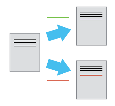
y después estos son compatibilizados e incorporados en un único documento.
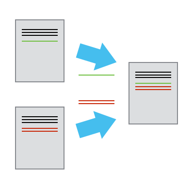
En casos en que los autores trabajen en zonas distintas la compaginación se puede hacer en forma automática. Por otro lado, si dos personas cambian la misma frase obviamente se necesita tomar una decisión y la compaginación no puede (ni quiere) hacerse automáticamente.
Historia completa
Otra característica importante de los sistemas de control de versiones es que guardan la historia completa de todos los archivos que componen el proyecto. Imaginen, por ejemplo, que escribieron una función para resolver parte de un problema. La función no sólo hace su trabajo sino que está muy bien escrita, es elegante y funciona rápidamente. Unos días después encuentran que toda esa belleza era innecesaria, porque el problema que resuelve la función no aparece en su proyecto, y por supuesto la borra. La version oficial no tiene esa parte del código.
Dos semanas, y varias líneas de código, después aparece un problema parecido y querríamos tener la función que borramos …
Los sistemas de control de versiones guardan toda la información de la historia de cada archivo, con un comentario del autor. Este modo de trabajar nos permite recuperar (casi) toda la información previa, incluso aquella que en algún momento decidimos descartar.
Instalación
Vamos a describir uno de los posibles sistemas de control de versiones, llamado git
En Linux, usando el administrador de programas, algo así como:
en Ubuntu:
$ sudo apt-get install git
o usando dnf en Fedora:
$ sudo dnf install git
En Windows, se puede descargar Git for Windows desde este enlace, ejecutar el instalador y seguir las instrucciones. Viene con una terminal y una interfaz gráfica.
Interfaces gráficas
Existen muchas interfaces gráficas, para todos los sistemas operativos.
Ver por ejemplo Git Extensions, git-cola, Code Review, o cualquiera de esta larga lista de interfaces gráficas a Git.
Documentación
Buscando en internet el término git se encuentra mucha documentación. En particular el libro Pro Git tiene información muy accesible y completa.
El programa se usa en la forma:
$ git <comando> [opciones]
Por ejemplo, para obtener ayuda directamente desde el programa, se puede utilizar cualquiera de las opciones:
$ git help
$ git --help
que nos da información sobre su uso, y cuáles son los comandos disponibles. Si queremos obtener información sobre un comando en particular, agregamos el comando de interés. Para el comando de configuración sería:
$ git config --help
$ git help config
Configuración básica
Una vez que está instalado, es conveniente configurarlo desde una terminal, con los comandos:
$ git config --global user.name "Juan Fiol"
$ git config --global user.email "fiol@cab.cnea.gov.ar"
Si necesitamos usar un proxy para acceder fuera del lugar de trabajo:
$ git config --global http.proxy proxy-url
$ git config --global https.proxy proxy-url
Acá hemos usado la opción –global para que las variables configuradas se apliquen a todos los repositorios con los que trabajamos.
Si necesitamos desabilitar una variable, por ejemplo el proxy, podemos hacer:
$ git config --global unset http.proxy
$ git config --global unset https.proxy
Creación de un nuevo repositorio
Si ya estamos trabajando en un proyecto, tenemos algunos archivos de trabajo, sin control de versiones, y queremos empezar a controlarlo, inicializamos el repositorio local con:
$ git init
Este comando sólo inicializa el repositorio, no pone ningún archivo bajo control de versiones.
Clonación de un repositorio existente
Otra situación bastante común ocurre cuando queremos tener una copia local de un proyecto (grupo de archivos) que ya existe y está siendo controlado por git. En este caso utilizamos el comando clone en la forma:
$ git clone <url-del-repositorio> [nombre-local]
donde el argumento nombre-local es opcional, si queremos darle a nuestra copia un nombre diferente al que tiene en el repositorio
Ejemplos:
$ git clone /home/fiol/my-path/programa
$ git clone /home/fiol/my-path/programa programa-de-calculo
$ git clone https://github.com/fiolj/intro-python-IB.git
$ git clone https://github.com/fiolj/intro-python-IB.git clase-ib
Los dos primeros ejemplos realizan una copia de trabajo de un proyecto alojado también localmente. En el segundo y cuarto casos les estamos dando un nuevo nombre a la copia local de trabajo.
En los últimos tres ejemplos estamos copiando proyectos alojados en repositorios remotos, cuyo uso es bastante popular: bitbucket, gitlab, y github.
Lo que estamos haciendo con estos comandos es copiar no sólo la versión actual del proyecto sino toda su historia. Después de ejecutar este comando tendremos en nuestra computadora cada versión de cada uno de los archivos del proyecto, con la información de quién hizo los cambios y cuándo se hicieron.
Una vez que ya tenemos una copia local de un proyecto vamos a querer trabajar: modificar los archivos, agregar nuevos, borrar alguno, etc.
Ver el estado actual
Para determinar qué archivos se cambiaron utilizamos el comando status:
$ cd my-directorio
$ git status
Creación de nuevos archivos y modificación de existentes
Después de trabajar en un archivo existente, o crear un nuevo archivo que queremos controlar, debemos agregarlo al registro de control:
$ git add <nuevo-archivo>
$ git add <archivo-modificado>
Esto sólo agrega la versión actual del archivo al listado a controlar. Para incluir una copia en la base de datos del repositorio debemos realizar lo que se llama un «commit»
$ git commit -m "Mensaje para recordar que hice con estos archivos"
La opción -m y su argumento (el string entre comillas) es un mensaje que dejamos grabado, asociado a los cambios realizados. Puede realizarse el commit sin esta opción, y entonces git abrirá un editor de texto para que escribamos el mensaje (que no puede estar vacío).
Actualización de un repositorio remoto
Una vez que se añaden o modifican los archivos, y se agregan al repositorio local, podemos enviar los cambios a un repositorio remoto. Para ello utilizamos el comando:
$ git push
De la misma manera, si queremos obtener una actualización del repositorio remoto (poque alguien más la modificó), utilizamos el (los) comando(s):
$ git fetch
Este comando sólo actualiza el repositorio, pero no modifica los archivos locales. Esto se puede hacer, cuando uno quiera, luego con el comando:
$ git merge
Estos dos comandos, pueden generalmente reemplazarse por un único comando:
$ git pull
que realizará la descarga desde el repositorio remoto y la actualización de los archivos locales en un sólo paso.
Puntos importantes
Control de versiones |
Historia de cambios y «undo» ilimitado |
Configuración |
git config, con la opción –global |
Creación |
git init inicializa el repositorio |
git clone copia un repositorio |
|
Modificación |
git status muestra el estado actual |
git add pone archivos bajo control |
|
git commit graba la versión actual |
|
Explorar las versiones |
git log muestra la historia de cambios |
git diff compara versiones |
|
git checkout recupera versiones previas |
|
Comunicación con remotos |
git push Envía los cambios al remoto |
git pull copia los cambios desde remoto |
Importando módulos
Python tiene reglas para la importación de módulos a nuestro código. Un
módulo es un archivo cuya extensión es .py. Supongamos que tenemos
un módulo rotacion_p.py.
En primer lugar, el intérprete busca un módulo denominado
rotación_pdentro de los módulos incorporados automáticamente. La lista de dichos módulos se encuentra usando el métodosys.builtin_module_names:
import sys
sys.builtin_module_names
('_abc',
 '_ast',
 '_codecs',
 '_collections',
 '_datetime',
 '_functools',
 '_imp',
 '_io',
 '_locale',
 '_operator',
 '_signal',
 '_sre',
 '_stat',
 '_string',
 '_suggestions',
 '_symtable',
 '_sysconfig',
 '_thread',
 '_tokenize',
 '_tracemalloc',
 '_typing',
 '_warnings',
 '_weakref',
 'atexit',
 'builtins',
 'errno',
 'faulthandler',
 'gc',
 'itertools',
 'marshal',
 'posix',
 'pwd',
 'sys',
 'time')
'rotacion_p' in sys.builtin_module_names
False
En segundo lugar, busca un archivo
rotacion_p.pyen una lista de directorios dada por el atributosys.path.
sys.path
['/usr/lib64/python313.zip',
 '/usr/lib64/python3.13',
 '/usr/lib64/python3.13/lib-dynload',
 '',
 '/home/fiol/.local/lib/python3.13/site-packages',
 '/home/fiol/Trabajos/tof-related/tof-simulator',
 '/usr/lib64/python3.13/site-packages',
 '/usr/lib/python3.13/site-packages']
Este atributo contiene el directorio local (el primero que aparece en la
lista de arriba), y una serie de directorios que provienen de - La
variable de entorno PYTHONPATH - Un directorio dependiente de la
instalación (en este caso,
’/Users/flavioc/miniconda3/envs/clases/lib/python3.11`).
La manera pythonística de chequear si la variable de entorno
PYTHONPATH existe es utilizar el método get de os.environ:
import os
os.environ.get('PYTHONPATH')
En nuestro caso no imprime nada, pero de la misma forma se puede setear dicha variable de entorno:
os.environ['PYTHONPATH'] = '..' # seteo la variable PYTHONPATH al directorio padre del directorio actual
os.environ.get('PYTHONPATH')
'..'
Por supuesto, todo va a depender de cómo tenemos estructurado nuestro código. En principio, aún cuando uno no utilice completamente las facilidades de Python como lenguaje orientado a objeto, agrupamos funciones que están relacionadas entre sí en distintos módulos. A medida que el código crece, es posible organizar los distintos módulos distribuyéndolos en directorios.
Importando módulos de directorios hijos
Imaginemos que tenemos la siguente estructura de código:
/miproyecto
    main.py
    /lib
        rotacion.py
    /graficos
        simple.py
        complejo.py
        /tresd
        vector.py
Es sencillo importar los módulos en los directorios hijos (lib,
graficos):
from graficos.simple import plot_data
from graficos.complejo import plot_data_complejo as plot_complejo
from graficos.tresd.vector import *
from lib.rotacion import rotate
Básicamente exponemos el módulo usando el operador . para ir
incorporando los hijos. Por ejemplo, graficos.tresd.vector refiere
al módulo que se encuentra en el archivo vector.py en el directorio
graficos.tresd.
Importando módulos desde padres o hermanos
Imports relativos
Para importar módulos que están en directorios padres o hermanos (estos
últimos son directorios al mismo nivel del directorio desde el cual
quiero importar) podemos diferentes estrategias. La primera de ellas es
usar la importación de paquetes relativos. Para ello, cada directorio
desde el que quiera importar debe poseer un archivo (en principio vacío)
denominado __init__.py. Esto permite a Python reconocer los
directorios que contienen módulos aún cuando sean padres o hermanos.
Veamos ahora la estructura de directorios de miproyecto_relativo con
los archivos __init__.py agregados:
/miproyecto
    main.py
    __init__.py
    /lib
        rotacion.py
        __init__.py
    /graficos
        __init__.py
        simple.py
        complejo.py
        /tresd
        __init__.py
        vector.py
    /tests
        test_rotacion.py
Notemos que tests/test_rotacion.py tiene también un main, que
corre un test:
def test_rotacion():
  v = np.array([1, 0, 0])
  angle = np.array([0, 0, np.pi/2])
  assert np.allclose(rotate(angle, v), np.array([0, -1, 0]))


if __name__ == "__main__":
  test_rotacion()
  print("All tests passed")
Esta es una estructura típica de Python, donde tengo tests que prueban
funciones en un módulo dado. Notemos cómo se importa el módulo
rotacion desde test_rotacion.py:
from ..lib.rotacion import rotate
Al igual que con directorios, .. se refiere al directorio padre
relativo al directorio actual.
Si probamos desde el directorio miproyecto/tests lo siguiente:
python test_rotacion.py
Nos encontraremos con el error:
ImportError: attempted relative import with no known parent package
Para correr el test, tenemos que ir al directorio padre del proyecto y correr el main del módulo explícitamente:
python -m miproyecto_relativo.tests.test_rotacion
All tests passed
Modificando sys.path
La forma anterior puede ser engorrosa en el caso en que se tengan muchos
módulos en archivos distribuidos en una estructura de directorios
complicada. Por otra parte, es posible modificar el atributo
sys.path para incluir el directorio que sea de interés. En este
caso, modificamos test_rotacion.py:
import sys
import os
sys.path.append(os.path.join(os.path.dirname(__file__), ".."))
from lib.rotacion import rotate
Entonces, podemos correr desde el directorio tests:
python test_rotacion.py
All tests passed
o desde su padre como
python -m tests.test_rotacion
o
python tests/test_rotacion.py
Algunos módulos (biblioteca standard)
Los módulos pueden pensarse como bibliotecas de objetos (funciones, datos, etc) que pueden usarse según la necesidad. Hay una biblioteca standard con rutinas para muchas operaciones comunes, y además existen muchos paquetes específicos para distintas tareas. Veamos algunos ejemplos:
Módulo sys
Este módulo da acceso a variables que usa o mantiene el intérprete Python
import sys
sys.path
['/usr/lib64/python313.zip',
 '/usr/lib64/python3.13',
 '/usr/lib64/python3.13/lib-dynload',
 '',
 '/home/fiol/.local/lib/python3.13/site-packages',
 '/home/fiol/Trabajos/tof-related/tof-simulator',
 '/usr/lib64/python3.13/site-packages',
 '/usr/lib/python3.13/site-packages']
sys.getfilesystemencoding()
'utf-8'
sys.getsizeof(1)
28
sys.getsizeof("hola")
45
help(sys.getsizeof)
Help on built-in function getsizeof in module sys:

getsizeof(...)
    getsizeof(object [, default]) -> int

    Return the size of object in bytes.
Vemos que para utilizar las variables (path) o funciones (getsizeof) debemos referirlo anteponiendo el módulo en el cuál está definido (sys) y separado por un punto.
Cuando hacemos un programa, con definición de variables y funciones. Podemos utilizarlo como un módulo, de la misma manera que los que ya vienen definidos en la biblioteca standard o en los paquetes que instalamos.
Módulo os
El módulo os tiene utilidades para operar sobre nombres de archivos
y directorios de manera segura y portable, de manera que pueda
utilizarse en distintos sistemas operativos. Vamos a ver ejemplos de uso
de algunas facilidades que brinda:
import os

print(os.curdir)
print(os.pardir)
print (os.getcwd())
.
..
/home/fiol/Clases/IntPython/clases-python/clases
cur = os.getcwd()
par = os.path.abspath("..")
print(cur)
print(par)
/home/fiol/Clases/IntPython/clases-python/clases
/home/fiol/Clases/IntPython/clases-python
print(os.path.abspath(os.curdir))
print(os.getcwd())
/home/fiol/Clases/IntPython/clases-python/clases
/home/fiol/Clases/IntPython/clases-python/clases
print(os.path.basename(cur))
print(os.path.splitdrive(cur)) # Útil en Windows donde hay letras que identifican las unidades de disco
clases
('', '/home/fiol/Clases/IntPython/clases-python/clases')
print(os.path.commonprefix((cur, par)))
archivo = os.path.join(par,'este' , 'otro.dat')
print (archivo)
print (os.path.split(archivo))
print (os.path.splitext(archivo))
print (os.path.exists(archivo))
print (os.path.exists(cur))
/home/fiol/Clases/IntPython/clases-python
/home/fiol/Clases/IntPython/clases-python/este/otro.dat
('/home/fiol/Clases/IntPython/clases-python/este', 'otro.dat')
('/home/fiol/Clases/IntPython/clases-python/este/otro', '.dat')
False
True
Como es aparente de estos ejemplos, se puede acceder a todos los objetos
(funciones, variables) de un módulo utilizando simplemente la línea
import <modulo> pero puede ser tedioso escribir todo con prefijos
(como os.path.abspath) por lo que existen dos alternativas que
pueden ser más convenientes. La primera corresponde a importar todas las
definiciones de un módulo en forma implícita:
from os import *
Después de esta declaración usamos los objetos de la misma manera que
antes pero obviando la parte de os.
path.abspath(curdir)
'/home/fiol/Clases/IntPython/clases-python/clases'
Esto es conveniente en algunos casos pero no suele ser una buena idea en programas largos ya que distintos módulos pueden definir el mismo nombre, y se pierde información sobre su origen. Una alternativa que es conveniente y permite mantener mejor control es importar explícitamente lo que vamos a usar:
from os import curdir, pardir, getcwd
from os.path import abspath
print(abspath(pardir))
print(abspath(curdir))
print(abspath(getcwd()))
/home/fiol/Clases/IntPython/clases-python
/home/fiol/Clases/IntPython/clases-python/clases
/home/fiol/Clases/IntPython/clases-python/clases
Además podemos darle un nombre diferente al importar módulos u objetos
import os.path as path
from os import getenv as ge
help(ge)
Help on function getenv in module os:

getenv(key, default=None)
    Get an environment variable, return None if it doesn't exist.
    The optional second argument can specify an alternate default.
    key, default and the result are str.
ge('HOME')
'/home/fiol'
path.realpath(curdir)
'/home/fiol/Clases/IntPython/clases-python/clases'
Acá hemos importado el módulo os.path (es un sub-módulo) como
path y la función getenv del módulo os y la hemos renombrado
ge.
curdir
'.'
[a for a in os.walk(curdir)]
[('.',
  ['.ipynb_checkpoints',
   'explicacion_ejercicio_agujas_files',
   'scripts',
   'figuras',
   'version-control',
   '__pycache__',
   '08_1_intro_numpy_files',
   '09_1_intro_visualizacion_files',
   '09_2_personal_plot_files',
   '10_1_mas_arrays_files',
   '10_2_indexado_files',
   '11_1_intro_scipy_files',
   '11_2_scipy_al_files',
   '13_fiteos_files',
   '14_1_1_primer_ejemplo_files',
   '14_1_2_segundo_ejemplo_files',
   '14_3_imagenes_files',
   '14_1_3_quiver_files',
   '12_1_intro_scipy_files',
   '12_2_scipy_al_files',
   '15_2_pandas_files',
   'data',
   '10_1_intro_numpy_files',
   '10_3_intro_visualizacion_files',
   'obsoletos',
   '11_1_intro_visualizacion_files',
   '11_2_mas_visualizacion_files',
   '11_3_personal_plot_files',
   '12_2_indexado_files',
   '13_1_intro_scipy_files',
   '13_2_fiteos_files',
   '13_3_imagenes_files'],
  ['.emacs-buffers',
   '.emacs.desktop',
   '00_presentacion.html',
   'Untitled.ipynb',
   'array_atr.html',
   'array_atr.markdown',
   'array_atr.md',
   'array_atr.org',
   'array_atr.pdf',
   'datos.mat',
   'ejemplo08_1.pdf',
   'ejemplo08_1.png',
   'ejemplo08_2.pdf',
   'ejemplo08_2.png',
   'ejf.md',
   'interpkind.md',
   'interpkind.org',
   'keywords.md',
   'keywords.org',
   'licencia.html',
   'licencia.md',
   'notebook.tex',
   'programa.md',
   'programa_detalle.odt',
   'programa_detalle.pdf',
   'programa_python.html',
   'test.npy',
   '00_introd_y_excursion.rst',
   '02_1_tipos_y_control.rst',
   '02_2_listas.rst',
   '03_2_iteraciones_tipos.rst',
   '04_1_funciones.rst',
   '04_2_func_args.rst',
   '01_1_instala_y_uso.rst',
   '01_2_introd_python.rst',
   '06_1_objetos.rst',
   '06_2_objetos.rst',
   '08_1_intro_numpy.rst',
   '08_2_numpy_arrays.rst',
   '10_1_mas_arrays.rst',
   '10_2_indexado.rst',
   'complejos.dat',
   'complejos.npy',
   '11_1_intro_scipy.rst',
   '11_2_scipy_al.rst',
   'estimate_pi.ipynb',
   '12_Plotly3D.rst',
   '3dplot.html',
   '13_fiteos.rst',
   'Ejercicios_finales.ipynb',
   '01a_ej_agujas.markdown',
   '08_ejemplo_1.dat',
   '12_graficacion3d.ipynb',
   '18_miscelaneas.ipynb',
   'Ejercicios.ipynb',
   'comentarios_02.ipynb',
   'otros_temas.ipynb',
   'programa_tentativo.rst',
   '09_2_personal_plot.rst',
   '12_Plotly3D.ipynb',
   'C_Plotly3D.ipynb',
   '16_Python_funcional.rst',
   'Untitled1.ipynb',
   '16_fft.ipynb',
   '17_interfacing_y_animaciones.ipynb',
   'more_scipy.ipynb',
   '04_3_func_func.rst',
   'ejemplo_05_2.py',
   'Ejercicios 07.ipynb',
   '07_modulos_biblioteca.rst',
   'test.out',
   'test.dat',
   'test.txt',
   'estilo_test',
   'tmp.dat',
   '12_1_plotly.rst',
   '12_2_imagenes.rst',
   '12_3_plotly3D.rst',
   '14_1_animaciones.rst',
   '14_1_1_primer_ejemplo.rst',
   '14_1_2_segundo_ejemplo.rst',
   '14_1_3_quiver.rst',
   '14_2_interactivo.rst',
   '14_3_imagenes.rst',
   '15_1_interfacing_F.rst',
   '15_2_interfacing_C.rst',
   '15_3_interfacing_Cpp.rst',
   'Untitled2.ipynb',
   'Untitled3.ipynb',
   '02_1_modular.rst',
   '02_2_strings.rst',
   '02_3_listas.rst',
   'untitled.txt',
   'Untitled4.ipynb',
   '03_1_tiposcomplejos.rst',
   '03_2_control.rst',
   '00_introd_y_excursion.ipynb',
   '01_1_instala_y_uso.ipynb',
   '01_2_introd_python.ipynb',
   '02_1_modular.ipynb',
   '02_2_strings.ipynb',
   '02_3_listas.ipynb',
   '04_1_funciones.ipynb',
   '04_2_func_args.ipynb',
   '04_3_func_func.ipynb',
   'index.rst.tmpl',
   '04_1_iteraciones_func.ipynb',
   '04_1_iteraciones_func.rst',
   'tmp.txt',
   '07_2_ejemplo_oop.rst',
   'ej_plot_osc.png',
   'ej_plot_osc.pdf',
   'ej_oscil_aten_err.png',
   'ej_oscil_aten_err_B.png',
   '11_1_plotly.rst',
   '11_2_imagenes.rst',
   '11_3_plotly3D.rst',
   '07_1_decoradores_old.ipynb',
   '07_2_ejemplo_oop.ipynb',
   '07_modulos_biblioteca.ipynb',
   '09_1_intro_visualizacion.rst',
   '12_1_intro_scipy.rst',
   '12_2_scipy_al.rst',
   '14_1_interfacing_F.rst',
   '14_2_interfacing_C.rst',
   '14_3_interfacing_Cpp.rst',
   '12_2_scipy_al.ipynb',
   '14_1_1_primer_ejemplo.ipynb',
   '14_1_2_segundo_ejemplo.ipynb',
   '14_1_3_quiver.ipynb',
   '14_1_interfacing_F.ipynb',
   '14_2_interactivo.ipynb',
   '14_2_interfacing_C.ipynb',
   '14_3_interfacing_Cpp.ipynb',
   '15_3_animaciones.ipynb',
   'explicacion_ejercicio_agujas.ipynb',
   '11_1_plotly.ipynb',
   '15_1_importar_modulos.ipynb',
   '15_2_pandas.ipynb',
   '11_2_imagenes.ipynb',
   '11_3_plotly3D.ipynb',
   '15_1_importar_modulos.rst',
   '15_2_pandas.rst~',
   '15_2_pandas.rst',
   '15_3_animaciones.rst',
   '01_2_ambientes.ipynb',
   '01_2_ambientes.rst',
   '01_3_introd_python.ipynb',
   '01_3_introd_python.rst',
   '03_2_control.ipynb',
   '03_3_tiposcomplejos.ipynb',
   '03_1_maslistas.ipynb',
   '03_1_maslistas.rst',
   '03_3_tiposcomplejos.rst',
   '04_3_func_args_anotacion_de_tipos.ipynb',
   '04_3_func_args_anotacion_de_tipos.rst',
   '04_4_mypy.rst',
   '04_4_mypy.ipynb',
   '05_1_func_func.ipynb',
   '05_2_decoradores.ipynb',
   '05_3_funcional.ipynb',
   'entregas_ejercicios.rst',
   '05_1_func_func.rst',
   '05_2_decoradores.rst',
   '05_3_funcional.rst',
   '06_1_excepciones.ipynb',
   '06_2_intro_objetos.ipynb',
   '06_3_objetos.ipynb',
   '06_1_excepciones.rst',
   '06_2_intro_objetos.rst',
   '06_3_objetos.rst',
   '07_1_inout.ipynb',
   '07_1_inout.rst',
   '07_2_modulos_biblioteca.ipynb',
   '07_2_modulos_biblioteca.rst',
   'Untitled5.ipynb',
   '08_1_mas_sobre_objetos.ipynb',
   '08_2_enum_y_dataclasses.ipynb',
   '08_3_modulos_biblioteca.ipynb',
   '08_1_mas_sobre_objetos.rst',
   '08_2_enum_y_dataclasses.rst',
   'Untitled6.ipynb',
   '09_1_importar_modulos.ipynb',
   '09_2_modulos_biblioteca.ipynb',
   '09_1_importar_modulos.rst',
   '09_2_modulos_biblioteca.rst',
   '09_1_control_version.rst',
   '10_1_intro_numpy.ipynb',
   '10_2_numpy_arrays.ipynb',
   '10_1_intro_numpy.rst',
   '10_2_numpy_arrays.rst',
   '10_3_intro_visualizacion.rst',
   '11_2_mas_visualizacion.ipynb',
   '10_2_intro_visualizacion.rst',
   '11_1_intro_visualizacion.ipynb',
   '11_3_personal_plot.ipynb',
   '12_1_mas_arrays.ipynb',
   '11_1_intro_visualizacion.rst',
   'ej_oscil_aten_err.dat.png',
   '11_2_mas_visualizacion.rst',
   '11_3_personal_plot.rst',
   '12_2_indexado.ipynb',
   '12_1_mas_arrays.rst',
   '12_2_indexado.rst',
   '12_3_intro_scipy.rst',
   '13_1_intro_scipy.ipynb',
   '13_2_fiteos.ipynb',
   '13_3_interp_fit_2d.ipynb',
   '13_3_fit_2d.ipynb',
   '13_1_intro_scipy.rst',
   '13_widgets.ipynb',
   '14_3_imagenes.ipynb',
   '13_2_fiteos.rst',
   '13_3_imagenes.ipynb',
   '13_3_imagenes.rst',
   '14_1_pandas_io.rst',
   '14_2_pandas_series.rst',
   '14_3_pandas_dataframes.rst',
   'tmp01',
   'tmp01.ipynb',
   'tmp01.rst',
   '14_1_pandas_io.ipynb',
   '16_ejerc_correct.ipynb',
   '14_2_pandas_series.ipynb',
   '14_3_pandas_dataframes.ipynb',
   '15_1_pandas_plus.ipynb',
   '15_2_pandas_y_plot.ipynb']),
 ('./.ipynb_checkpoints',
  [],
  ['00_introd_y_excursion-checkpoint.ipynb',
   '02_2_listas-checkpoint.ipynb',
   '02_1_tipos_y_control-checkpoint.ipynb',
   '01_1_instala_y_uso-checkpoint.ipynb',
   '01_2_introd_python-checkpoint.ipynb',
   '04_1_funciones-checkpoint.ipynb',
   '05_1_inout-checkpoint.ipynb',
   '07_modulos_biblioteca-checkpoint.ipynb',
   '12_graficacion3d-checkpoint.ipynb',
   'otros_temas-checkpoint.ipynb',
   'comentarios_02-checkpoint.ipynb',
   '05_2_excepciones-checkpoint.ipynb',
   '04_3_decoradores-checkpoint.ipynb',
   '17_interfacing_y_animaciones-checkpoint.ipynb',
   '17_interfacing-checkpoint.ipynb',
   '05_1_decoradores-checkpoint.ipynb',
   '05_3_inout-checkpoint.ipynb',
   '06_1_objetos-checkpoint.ipynb',
   '06_2_objetos-checkpoint.ipynb',
   '08_2_numpy_arrays-checkpoint.ipynb',
   '08_1_intro_numpy-checkpoint.ipynb',
   '09_1_intro_visualizacion-checkpoint.ipynb',
   '09_2_personal_plot-checkpoint.ipynb',
   '13_fiteos-checkpoint.ipynb',
   '10_2_indexado-checkpoint.ipynb',
   '10_1_mas_arrays-checkpoint.ipynb',
   '10_mas_numpy-checkpoint.ipynb',
   '18_miscelaneas-checkpoint.ipynb',
   '14_interactivo-checkpoint.ipynb',
   '12_Plotly3D-checkpoint.ipynb',
   '11_2_scipy_al-checkpoint.ipynb',
   '11_1_intro_scipy-checkpoint.ipynb',
   '11_intro_scipy-checkpoint.ipynb',
   'estimate_pi-checkpoint.ipynb',
   'more_scipy-checkpoint.ipynb',
   '15_animaciones-checkpoint.ipynb',
   '10_entrada_salida-checkpoint.ipynb',
   '14_animaciones-checkpoint.ipynb',
   '15_interfacing_y_animaciones-checkpoint.ipynb',
   '16_fft-checkpoint.ipynb',
   'animate_decay-checkpoint.ipynb',
   '14_1_animaciones-checkpoint.ipynb',
   '14_2_interactivo-checkpoint.ipynb',
   'Untitled1-checkpoint.ipynb',
   '04_2_func_args-checkpoint.ipynb',
   '04_3_func_func-checkpoint.ipynb',
   '05_2_inout-checkpoint.ipynb',
   '05_3_excepciones-checkpoint.ipynb',
   '07_ejemplo_oop-checkpoint.ipynb',
   'Ejercicios 07-checkpoint.ipynb',
   '12_1_plotly-checkpoint.ipynb',
   '14_1_1_primer_ejemplo-checkpoint.ipynb',
   '14_1_2_segundo_ejemplo-checkpoint.ipynb',
   '14_1_3_quiver-checkpoint.ipynb',
   '14_3_imagenes-checkpoint.ipynb',
   '15_1_interfacing_F-checkpoint.ipynb',
   '15_2_interfacing_C-checkpoint.ipynb',
   '15_3_interfacing_Cpp-checkpoint.ipynb',
   '12_2_imagenes-checkpoint.ipynb',
   '02_1_strings-checkpoint.ipynb',
   '01_2_introd_python-checkpoint.rst',
   '01_1_instala_y_uso-checkpoint.rst',
   'Untitled2-checkpoint.ipynb',
   'Untitled3-checkpoint.ipynb',
   '02_0_func1-checkpoint.ipynb',
   '02_1_func1-checkpoint.ipynb',
   '02_2_strings-checkpoint.ipynb',
   '02_3_listas-checkpoint.ipynb',
   '02_1_modular-checkpoint.ipynb',
   'untitled-checkpoint.txt',
   'Untitled4-checkpoint.ipynb',
   '03_2_control-checkpoint.ipynb',
   '03_1_tiposcomplejos-checkpoint.ipynb',
   '03_3_iteraciones_tipos-checkpoint.ipynb',
   '04_1_iteraciones_tipos-checkpoint.ipynb',
   '04_1_iteraciones_func-checkpoint.ipynb',
   'tmp-checkpoint.txt',
   '07_1_decoradores_old-checkpoint.ipynb',
   '07_1_decoradores-checkpoint.ipynb',
   '07_2_ejemplo_oop-checkpoint.ipynb',
   '07_3_funcional-checkpoint.ipynb',
   '07_2_funcional-checkpoint.ipynb',
   'test-checkpoint.dat',
   'test-checkpoint.out',
   'ej_plot_osc-checkpoint.png',
   'ej_oscil_aten_err-checkpoint.png',
   'estilo_test-checkpoint',
   '12_1_intro_scipy-checkpoint.ipynb',
   '12_2_scipy_al-checkpoint.ipynb',
   '11_1_plotly-checkpoint.ipynb',
   '11_2_imagenes-checkpoint.ipynb',
   '11_3_plotly3D-checkpoint.ipynb',
   'explicacion_ejercicio_agujas-checkpoint.ipynb',
   '10_2_indexado-checkpoint.rst',
   '15_1_importar_modulos-checkpoint.ipynb',
   '15_2_pandas-checkpoint.ipynb',
   '15_3_animaciones-checkpoint.ipynb',
   '01_2_ambientes-checkpoint.ipynb',
   '03_1_listas-checkpoint.ipynb',
   '03_1_maslistas-checkpoint.ipynb',
   '03_3_tiposcomplejos-checkpoint.ipynb',
   '04_3_func_args_anotacion_de_tipos-checkpoint.ipynb',
   '04_4_mypy-checkpoint.rst',
   '04_4_mypy-checkpoint.ipynb',
   '05_1_func_func-checkpoint.ipynb',
   '05_2_decoradores-checkpoint.ipynb',
   '05_3_funcional-checkpoint.ipynb',
   '05_2_excepciones-checkpoint.rst',
   '06_1_excepciones-checkpoint.ipynb',
   '06_2_intro_objetos-checkpoint.ipynb',
   '06_3_objetos-checkpoint.ipynb',
   '05_2_decoradores-checkpoint.rst',
   '05_3_decoradores-checkpoint.ipynb',
   '07_2_enum_y_dataclasses-checkpoint.ipynb',
   '07_1_inout-checkpoint.ipynb',
   '07_3_modulos_biblioteca-checkpoint.ipynb',
   '07_4_importar_modulos-checkpoint.ipynb',
   '07_2_modulos_biblioteca-checkpoint.ipynb',
   'Untitled5-checkpoint.ipynb',
   'tmp-checkpoint.dat',
   '08_1_mas_sobre_objetos-checkpoint.ipynb',
   '08_2_enum_y_dataclasses-checkpoint.ipynb',
   'Untitled6-checkpoint.ipynb',
   '09_2_modulos_biblioteca-checkpoint.ipynb',
   '09_1_importar_modulos-checkpoint.ipynb',
   '11_1_mas_numpy_matplotlib-checkpoint.ipynb',
   '10_1_intro_numpy-checkpoint.ipynb',
   '10_1_intro_visualizacion-checkpoint.ipynb',
   '10_2_numpy_arrays-checkpoint.ipynb',
   '10_3_intro_visualizacion-checkpoint.ipynb',
   '11_2_mas_visualizacion-checkpoint.ipynb',
   '10_2_intro_visualizacion-checkpoint.ipynb',
   '11_1_intro_visualizacion-checkpoint.ipynb',
   '11_3_personal_plot-checkpoint.ipynb',
   '12_1_mas_arrays-checkpoint.ipynb',
   '12_2_indexado-checkpoint.ipynb',
   '12_3_intro_scipy-checkpoint.ipynb',
   '13_2_fiteos-checkpoint.ipynb',
   '13_1_intro_scipy-checkpoint.ipynb',
   '13_3_interp_fit_2d-checkpoint.ipynb',
   '13_3_fit_2d-checkpoint.ipynb',
   '13_3_imagenes-checkpoint.ipynb',
   '14_1_pandas_io-checkpoint.ipynb',
   '14_2_pandas_series-checkpoint.ipynb',
   '14_3_pandas_dataframes-checkpoint.ipynb',
   '01_3_introd_python-checkpoint.ipynb',
   '16_ejerc_correct-checkpoint.ipynb',
   '15_1_pandas_plus-checkpoint.ipynb']),
 ('./explicacion_ejercicio_agujas_files',
  [],
  ['explicacion_ejercicio_agujas_2_1.png',
   'explicacion_ejercicio_agujas_3_1.png']),
 ('./scripts',
  ['animaciones',
   'interfacing',
   '__pycache__',
   '.mypy_cache',
   '.ipynb_checkpoints',
   'miproyecto',
   'miproyecto_relativo',
   'proyecto'],
  ['03_ejemplo_3.py',
   '03_ejemplo_4.py',
   '07_ejemplo_oop.py',
   '07_ejemplo_oop_1.py',
   '07_ejemplo_oop_2.py',
   '10_palabras.py',
   '13_plot3d.py',
   'ej08.png',
   'ejemplo_05_2.py',
   'ejemplo_05_4.py',
   'ejemplo_07_1.py',
   'ejemplo_08_1.py',
   'ejemplo_08_2.py',
   'ejemplo_08_3.py',
   'ejemplo_08_4.py',
   'ejemplo_08_data_1.py',
   'ejemplo_08_data_2.py',
   'ejemplo_14_hexbin.py',
   'ejemplo_fft_1.py',
   'ejemplo_fft_2.py',
   'ejemplo_fft_3.py',
   'ejemplo_plot_08.eps',
   'ejemplo_plot_08.pdf',
   'ejemplo_plot_08.png',
   'ejemplo_plot_08_1.eps',
   'ejemplo_plot_08_1.pdf',
   'ejemplo_plot_08_1.png',
   'ejemplo_plot_08_5.png',
   'figure_1.png',
   'help_special.txt',
   'pi_comp_N.png',
   'pi_puntos.png',
   'read_tof.py',
   'timing.py',
   'zip1.py',
   '03_ejemplo_1.py',
   '03_ejemplo_2.py',
   '03_ejemplo_5.py',
   '04_ejemplo_1.py',
   '05_ejemplo_1.py',
   '13_sounds_1.py',
   'analizar_figura_1.py',
   'analizar_figura_2.py',
   'ejemplo_08_5.py',
   'ejemplo_callback.py',
   'ejemplo_cursor.py',
   'ejemplo_05_3.py',
   'ej_doppler_circ.py',
   'tmp.wav',
   'ej_deteccion_help.py',
   'mazes.py',
   'mypy_example.py']),
 ('./scripts/animaciones',
  [],
  ['quiver.mp4',
   'animate_decay.py',
   'double_pendulum_animated.py',
   'dynamic_image.py',
   'ejemplo_animation_0.py',
   'ejemplo_varios.py',
   'strip_chart.py',
   'subplots.py',
   'quiver.gif',
   'pelota.gif',
   'ejercicio_clase_cola.py~',
   'ejercicio_clase_cola.py',
   'ejemplo_animation_1.py',
   'ejemplo_quiver.py',
   'ejercicio_clase.py']),
 ('./scripts/interfacing',
  ['__pycache__'],
  ['c_rotacion.pyx',
   'fib1.cpython-35m-x86_64-linux-gnu.so',
   'fib1.cpython-36m-x86_64-linux-gnu.so',
   'fib1.f',
   'fib1.pyf',
   'fib1module.c',
   'fib2.cpython-35m-x86_64-linux-gnu.so',
   'fib2.cpython-36m-x86_64-linux-gnu.so',
   'fib2.pyf',
   'fib3.cpython-35m-x86_64-linux-gnu.so',
   'fib3.cpython-36m-x86_64-linux-gnu.so',
   'fib3.f',
   'rotacion.f90',
   'rotacion1.f90',
   'rotacion1_f',
   'rotacion1_f.cpython-35m-x86_64-linux-gnu.so',
   'rotacion_f',
   'rotacion_f.cpython-35m-x86_64-linux-gnu.so',
   'rotacion_f.cpython-36m-x86_64-linux-gnu.so',
   'rotacion_p.py',
   'rotacion_vectores.py',
   'rotaciones.mod']),
 ('./scripts/interfacing/__pycache__',
  [],
  ['rotacion_p.cpython-35.pyc', 'rotacion_p.cpython-36.pyc']),
 ('./scripts/__pycache__', [], ['ejemplo_cursor.cpython-310.pyc']),
 ('./scripts/.mypy_cache', ['3.11'], ['.gitignore', 'CACHEDIR.TAG']),
 ('./scripts/.mypy_cache/3.11',
  ['sys',
   'os',
   'importlib',
   'email',
   'collections',
   '_typeshed',
   'json',
   'numpy',
   'ctypes',
   'logging',
   'unittest'],
  ['zipfile.data.json',
   'zipfile.meta.json',
   'typing_extensions.data.json',
   'typing_extensions.meta.json',
   'typing.data.json',
   'typing.meta.json',
   'types.data.json',
   'types.meta.json',
   'subprocess.data.json',
   'subprocess.meta.json',
   'sre_parse.data.json',
   'sre_parse.meta.json',
   'sre_constants.data.json',
   'sre_constants.meta.json',
   'sre_compile.data.json',
   'sre_compile.meta.json',
   're.data.json',
   're.meta.json',
   'posixpath.data.json',
   'posixpath.meta.json',
   'pathlib.data.json',
   'pathlib.meta.json',
   'io.data.json',
   'io.meta.json',
   'genericpath.data.json',
   'genericpath.meta.json',
   'enum.data.json',
   'enum.meta.json',
   'dataclasses.data.json',
   'dataclasses.meta.json',
   'contextlib.data.json',
   'contextlib.meta.json',
   'codecs.data.json',
   'codecs.meta.json',
   'abc.data.json',
   'abc.meta.json',
   '_collections_abc.data.json',
   '_collections_abc.meta.json',
   '_codecs.data.json',
   '_codecs.meta.json',
   '_ast.data.json',
   '_ast.meta.json',
   'builtins.data.json',
   'builtins.meta.json',
   'pickle.data.json',
   'pickle.meta.json',
   'string.data.json',
   'string.meta.json',
   'textwrap.data.json',
   'textwrap.meta.json',
   '_warnings.data.json',
   '_warnings.meta.json',
   'functools.data.json',
   'functools.meta.json',
   'numbers.data.json',
   'numbers.meta.json',
   'time.data.json',
   'time.meta.json',
   'math.data.json',
   'math.meta.json',
   'ast.data.json',
   'ast.meta.json',
   '__future__.data.json',
   '__future__.meta.json',
   '_thread.data.json',
   '_thread.meta.json',
   'threading.data.json',
   'threading.meta.json',
   '_random.data.json',
   '_random.meta.json',
   'array.data.json',
   'array.meta.json',
   '_ctypes.data.json',
   '_ctypes.meta.json',
   'mmap.data.json',
   'mmap.meta.json',
   '_decimal.data.json',
   '_decimal.meta.json',
   'warnings.data.json',
   'warnings.meta.json',
   'datetime.data.json',
   'datetime.meta.json',
   'queue.data.json',
   'queue.meta.json',
   'decimal.data.json',
   'decimal.meta.json',
   'fractions.data.json',
   'fractions.meta.json',
   'random.data.json',
   'random.meta.json',
   '@plugins_snapshot.json']),
 ('./scripts/.mypy_cache/3.11/sys',
  [],
  ['__init__.data.json', '__init__.meta.json']),
 ('./scripts/.mypy_cache/3.11/os',
  [],
  ['path.data.json',
   'path.meta.json',
   '__init__.data.json',
   '__init__.meta.json']),
 ('./scripts/.mypy_cache/3.11/importlib',
  ['resources', 'metadata'],
  ['readers.data.json',
   'readers.meta.json',
   'machinery.data.json',
   'machinery.meta.json',
   'abc.data.json',
   'abc.meta.json',
   '__init__.data.json',
   '__init__.meta.json']),
 ('./scripts/.mypy_cache/3.11/importlib/resources',
  [],
  ['abc.data.json',
   'abc.meta.json',
   '__init__.data.json',
   '__init__.meta.json']),
 ('./scripts/.mypy_cache/3.11/importlib/metadata',
  [],
  ['_meta.data.json',
   '_meta.meta.json',
   '__init__.data.json',
   '__init__.meta.json']),
 ('./scripts/.mypy_cache/3.11/email',
  [],
  ['policy.data.json',
   'policy.meta.json',
   'message.data.json',
   'message.meta.json',
   'header.data.json',
   'header.meta.json',
   'errors.data.json',
   'errors.meta.json',
   'contentmanager.data.json',
   'contentmanager.meta.json',
   'charset.data.json',
   'charset.meta.json',
   '__init__.data.json',
   '__init__.meta.json']),
 ('./scripts/.mypy_cache/3.11/collections',
  [],
  ['abc.data.json',
   'abc.meta.json',
   '__init__.data.json',
   '__init__.meta.json']),
 ('./scripts/.mypy_cache/3.11/_typeshed',
  [],
  ['__init__.data.json', '__init__.meta.json']),
 ('./scripts/.mypy_cache/3.11/json',
  [],
  ['encoder.data.json',
   'encoder.meta.json',
   'decoder.data.json',
   'decoder.meta.json',
   '__init__.data.json',
   '__init__.meta.json']),
 ('./scripts/.mypy_cache/3.11/numpy',
  ['testing',
   'polynomial',
   'compat',
   'lib',
   '_typing',
   'core',
   'matrixlib',
   'ma',
   'random',
   'fft',
   'linalg',
   'typing'],
  ['_pytesttester.data.json',
   '_pytesttester.meta.json',
   '_version.data.json',
   '_version.meta.json',
   'version.data.json',
   'version.meta.json',
   'ctypeslib.data.json',
   'ctypeslib.meta.json',
   '__init__.data.json',
   '__init__.meta.json']),
 ('./scripts/.mypy_cache/3.11/numpy/testing',
  ['_private'],
  ['__init__.data.json', '__init__.meta.json']),
 ('./scripts/.mypy_cache/3.11/numpy/testing/_private',
  [],
  ['__init__.data.json',
   '__init__.meta.json',
   'utils.data.json',
   'utils.meta.json']),
 ('./scripts/.mypy_cache/3.11/numpy/polynomial',
  [],
  ['polyutils.data.json',
   'polyutils.meta.json',
   '_polybase.data.json',
   '_polybase.meta.json',
   'polynomial.data.json',
   'polynomial.meta.json',
   'legendre.data.json',
   'legendre.meta.json',
   'laguerre.data.json',
   'laguerre.meta.json',
   'hermite_e.data.json',
   'hermite_e.meta.json',
   'hermite.data.json',
   'hermite.meta.json',
   'chebyshev.data.json',
   'chebyshev.meta.json',
   '__init__.data.json',
   '__init__.meta.json']),
 ('./scripts/.mypy_cache/3.11/numpy/compat',
  [],
  ['_inspect.data.json',
   '_inspect.meta.json',
   'py3k.data.json',
   'py3k.meta.json',
   '__init__.data.json',
   '__init__.meta.json']),
 ('./scripts/.mypy_cache/3.11/numpy/lib',
  [],
  ['_version.data.json',
   '_version.meta.json',
   'format.data.json',
   'format.meta.json',
   '__init__.data.json',
   '__init__.meta.json',
   'utils.data.json',
   'utils.meta.json',
   'ufunclike.data.json',
   'ufunclike.meta.json',
   'type_check.data.json',
   'type_check.meta.json',
   'twodim_base.data.json',
   'twodim_base.meta.json',
   'stride_tricks.data.json',
   'stride_tricks.meta.json',
   'shape_base.data.json',
   'shape_base.meta.json',
   'polynomial.data.json',
   'polynomial.meta.json',
   'npyio.data.json',
   'npyio.meta.json',
   'nanfunctions.data.json',
   'nanfunctions.meta.json',
   'index_tricks.data.json',
   'index_tricks.meta.json',
   'histograms.data.json',
   'histograms.meta.json',
   'function_base.data.json',
   'function_base.meta.json',
   'arrayterator.data.json',
   'arrayterator.meta.json',
   'arraysetops.data.json',
   'arraysetops.meta.json',
   'arraypad.data.json',
   'arraypad.meta.json',
   'scimath.data.json',
   'scimath.meta.json',
   'mixins.data.json',
   'mixins.meta.json']),
 ('./scripts/.mypy_cache/3.11/numpy/_typing',
  [],
  ['_shape.data.json',
   '_shape.meta.json',
   '_char_codes.data.json',
   '_char_codes.meta.json',
   '_nbit.data.json',
   '_nbit.meta.json',
   '_nested_sequence.data.json',
   '_nested_sequence.meta.json',
   '_generic_alias.data.json',
   '_generic_alias.meta.json',
   '_scalars.data.json',
   '_scalars.meta.json',
   '_dtype_like.data.json',
   '_dtype_like.meta.json',
   '_array_like.data.json',
   '_array_like.meta.json',
   '__init__.data.json',
   '__init__.meta.json',
   '_extended_precision.data.json',
   '_extended_precision.meta.json',
   '_callable.data.json',
   '_callable.meta.json',
   '_add_docstring.data.json',
   '_add_docstring.meta.json',
   '_ufunc.data.json',
   '_ufunc.meta.json']),
 ('./scripts/.mypy_cache/3.11/numpy/core',
  [],
  ['__init__.data.json',
   '__init__.meta.json',
   'overrides.data.json',
   'overrides.meta.json',
   'umath.data.json',
   'umath.meta.json',
   'shape_base.data.json',
   'shape_base.meta.json',
   'numerictypes.data.json',
   'numerictypes.meta.json',
   'numeric.data.json',
   'numeric.meta.json',
   'multiarray.data.json',
   'multiarray.meta.json',
   'einsumfunc.data.json',
   'einsumfunc.meta.json',
   'arrayprint.data.json',
   'arrayprint.meta.json',
   '_ufunc_config.data.json',
   '_ufunc_config.meta.json',
   '_type_aliases.data.json',
   '_type_aliases.meta.json',
   '_asarray.data.json',
   '_asarray.meta.json',
   'fromnumeric.data.json',
   'fromnumeric.meta.json',
   'function_base.data.json',
   'function_base.meta.json',
   '_internal.data.json',
   '_internal.meta.json',
   'records.data.json',
   'records.meta.json',
   'defchararray.data.json',
   'defchararray.meta.json']),
 ('./scripts/.mypy_cache/3.11/numpy/matrixlib',
  [],
  ['defmatrix.data.json',
   'defmatrix.meta.json',
   '__init__.data.json',
   '__init__.meta.json']),
 ('./scripts/.mypy_cache/3.11/numpy/ma',
  [],
  ['core.data.json',
   'core.meta.json',
   'extras.data.json',
   'extras.meta.json',
   'mrecords.data.json',
   'mrecords.meta.json',
   '__init__.data.json',
   '__init__.meta.json']),
 ('./scripts/.mypy_cache/3.11/numpy/random',
  [],
  ['bit_generator.data.json',
   'bit_generator.meta.json',
   'mtrand.data.json',
   'mtrand.meta.json',
   '_sfc64.data.json',
   '_sfc64.meta.json',
   '_philox.data.json',
   '_philox.meta.json',
   '_pcg64.data.json',
   '_pcg64.meta.json',
   '_mt19937.data.json',
   '_mt19937.meta.json',
   '_generator.data.json',
   '_generator.meta.json',
   '__init__.data.json',
   '__init__.meta.json']),
 ('./scripts/.mypy_cache/3.11/numpy/fft',
  [],
  ['helper.data.json',
   'helper.meta.json',
   '_pocketfft.data.json',
   '_pocketfft.meta.json',
   '__init__.data.json',
   '__init__.meta.json']),
 ('./scripts/.mypy_cache/3.11/numpy/linalg',
  [],
  ['linalg.data.json',
   'linalg.meta.json',
   '__init__.data.json',
   '__init__.meta.json']),
 ('./scripts/.mypy_cache/3.11/numpy/typing',
  [],
  ['__init__.data.json', '__init__.meta.json']),
 ('./scripts/.mypy_cache/3.11/ctypes',
  [],
  ['__init__.data.json', '__init__.meta.json']),
 ('./scripts/.mypy_cache/3.11/logging',
  [],
  ['__init__.data.json', '__init__.meta.json']),
 ('./scripts/.mypy_cache/3.11/unittest',
  [],
  ['result.data.json',
   'result.meta.json',
   '_log.data.json',
   '_log.meta.json',
   'case.data.json',
   'case.meta.json',
   'async_case.data.json',
   'async_case.meta.json',
   'suite.data.json',
   'suite.meta.json',
   'signals.data.json',
   'signals.meta.json',
   'runner.data.json',
   'runner.meta.json',
   'loader.data.json',
   'loader.meta.json',
   'main.data.json',
   'main.meta.json',
   '__init__.data.json',
   '__init__.meta.json']),
 ('./scripts/.ipynb_checkpoints', [], ['analizar_figura_1-checkpoint.py']),
 ('./scripts/miproyecto', ['graficos', 'lib'], ['main.py']),
 ('./scripts/miproyecto/graficos', ['tresd'], ['complejo.py', 'simple.py']),
 ('./scripts/miproyecto/graficos/tresd', [], ['vector.py']),
 ('./scripts/miproyecto/lib', [], ['rotacion.py']),
 ('./scripts/miproyecto_relativo', ['graficos', 'lib', 'tests'], ['main.py']),
 ('./scripts/miproyecto_relativo/graficos',
  ['tresd'],
  ['__init__.py', 'complejo.py', 'simple.py']),
 ('./scripts/miproyecto_relativo/graficos/tresd', [], ['vector.py']),
 ('./scripts/miproyecto_relativo/lib', [], ['__init__.py', 'rotacion.py']),
 ('./scripts/miproyecto_relativo/tests', [], ['test_rotacion.py']),
 ('./scripts/proyecto',
  ['paquete1', 'paquete2'],
  ['main.py', 'main_nb.ipynb', 'modulo.py']),
 ('./scripts/proyecto/paquete1', [], ['__init__.py', 'moduloA.py']),
 ('./scripts/proyecto/paquete2', [], ['__init__.py', 'moduloB.py']),
 ('./version-control',
  ['_images', '_sources', '_static'],
  ['01_introduccion.html',
   '02_instalacion_uso.html',
   'genindex.html',
   'index.html',
   'keypoints.html',
   'objects.inv',
   'search.html',
   'searchindex.js',
   '.buildinfo',
   '.nojekyll']),
 ('./version-control/_images',
  [],
  ['alternativa.png', 'merge.svg', 'phd101212s.png', 'versions.svg']),
 ('./version-control/_sources',
  [],
  ['01_introduccion.rst.txt',
   '02_instalacion_uso.rst.txt',
   'index.rst.txt',
   'keypoints.rst.txt']),
 ('./version-control/_static',
  ['css', 'fonts', 'js'],
  ['_stemmer.js',
   'ajax-loader.gif',
   'basic.css',
   'comment-bright.png',
   'comment-close.png',
   'comment.png',
   'doctools.js',
   'documentation_options.js',
   'down-pressed.png',
   'down.png',
   'file.png',
   'jquery-3.1.0.js',
   'jquery-3.2.1.js',
   'jquery.js',
   'minus.png',
   'plus.png',
   'pygments.css',
   'rtd_overrides.css',
   'searchtools.js',
   'translations.js',
   'underscore-1.3.1.js',
   'underscore.js',
   'up-pressed.png',
   'up.png',
   'websupport.js']),
 ('./version-control/_static/css', [], ['badge_only.css', 'theme.css']),
 ('./version-control/_static/fonts',
  ['Lato', 'RobotoSlab'],
  ['Inconsolata-Bold.ttf',
   'Inconsolata-Regular.ttf',
   'Lato-Bold.ttf',
   'Lato-BoldItalic.ttf',
   'Lato-Italic.ttf',
   'Lato-Regular.ttf',
   'RobotoSlab-Bold.ttf',
   'RobotoSlab-Regular.ttf',
   'fontawesome-webfont.eot',
   'fontawesome-webfont.svg',
   'fontawesome-webfont.ttf',
   'fontawesome-webfont.woff',
   'fontawesome-webfont.woff2']),
 ('./version-control/_static/fonts/Lato',
  [],
  ['lato-bold.eot',
   'lato-bold.ttf',
   'lato-bold.woff',
   'lato-bold.woff2',
   'lato-bolditalic.eot',
   'lato-bolditalic.ttf',
   'lato-bolditalic.woff',
   'lato-bolditalic.woff2',
   'lato-italic.eot',
   'lato-italic.ttf',
   'lato-italic.woff',
   'lato-italic.woff2',
   'lato-regular.eot',
   'lato-regular.ttf',
   'lato-regular.woff',
   'lato-regular.woff2']),
 ('./version-control/_static/fonts/RobotoSlab',
  [],
  ['roboto-slab-v7-bold.eot',
   'roboto-slab-v7-bold.ttf',
   'roboto-slab-v7-bold.woff',
   'roboto-slab-v7-bold.woff2',
   'roboto-slab-v7-regular.eot',
   'roboto-slab-v7-regular.ttf',
   'roboto-slab-v7-regular.woff',
   'roboto-slab-v7-regular.woff2']),
 ('./version-control/_static/js', [], ['modernizr.min.js', 'theme.js']),
 ('./__pycache__', [], ['ejemplo_05_2.cpython-311.pyc']),
 ('./08_1_intro_numpy_files', [], []),
 ('./09_1_intro_visualizacion_files', [], []),
 ('./09_2_personal_plot_files', [], []),
 ('./10_1_mas_arrays_files', [], []),
 ('./10_2_indexado_files', [], []),
 ('./11_1_intro_scipy_files', [], []),
 ('./11_2_scipy_al_files', [], []),
 ('./13_fiteos_files', [], []),
 ('./14_1_1_primer_ejemplo_files', [], ['14_1_1_primer_ejemplo_1_0.png']),
 ('./14_1_2_segundo_ejemplo_files', [], ['14_1_2_segundo_ejemplo_2_0.png']),
 ('./14_3_imagenes_files', [], []),
 ('./14_1_3_quiver_files', [], ['14_1_3_quiver_7_1.png']),
 ('./12_1_intro_scipy_files', [], []),
 ('./12_2_scipy_al_files', [], []),
 ('./15_2_pandas_files', [], ['15_2_pandas_37_0.png']),
 ('./10_1_intro_numpy_files', [], []),
 ('./10_3_intro_visualizacion_files', [], []),
 ('./obsoletos',
  [],
  ['07_2_enum_y_dataclasses.ipynb',
   '07_4_importar_modulos.ipynb',
   '08_1_intro_numpy.ipynb',
   '09_1_intro_visualizacion.ipynb',
   '17_interfacing.ipynb',
   'old_04_2_func_args.ipynb']),
 ('./11_1_intro_visualizacion_files', [], []),
 ('./11_2_mas_visualizacion_files', [], []),
 ('./11_3_personal_plot_files', [], []),
 ('./12_2_indexado_files', [], []),
 ('./13_1_intro_scipy_files', [], []),
 ('./13_2_fiteos_files', [], []),
 ('./13_3_imagenes_files', [], [])]
help(os.walk)
Help on function walk in module os:

walk(top, topdown=True, onerror=None, followlinks=False)
    Directory tree generator.

    For each directory in the directory tree rooted at top (including top
    itself, but excluding '.' and '..'), yields a 3-tuple

        dirpath, dirnames, filenames

    dirpath is a string, the path to the directory.  dirnames is a list of
    the names of the subdirectories in dirpath (including symlinks to directories,
    and excluding '.' and '..').
    filenames is a list of the names of the non-directory files in dirpath.
    Note that the names in the lists are just names, with no path components.
    To get a full path (which begins with top) to a file or directory in
    dirpath, do os.path.join(dirpath, name).

    If optional arg 'topdown' is true or not specified, the triple for a
    directory is generated before the triples for any of its subdirectories
    (directories are generated top down).  If topdown is false, the triple
    for a directory is generated after the triples for all of its
    subdirectories (directories are generated bottom up).

    When topdown is true, the caller can modify the dirnames list in-place
    (e.g., via del or slice assignment), and walk will only recurse into the
    subdirectories whose names remain in dirnames; this can be used to prune the
    search, or to impose a specific order of visiting.  Modifying dirnames when
    topdown is false has no effect on the behavior of os.walk(), since the
    directories in dirnames have already been generated by the time dirnames
    itself is generated. No matter the value of topdown, the list of
    subdirectories is retrieved before the tuples for the directory and its
    subdirectories are generated.

    By default errors from the os.scandir() call are ignored.  If
    optional arg 'onerror' is specified, it should be a function; it
    will be called with one argument, an OSError instance.  It can
    report the error to continue with the walk, or raise the exception
    to abort the walk.  Note that the filename is available as the
    filename attribute of the exception object.

    By default, os.walk does not follow symbolic links to subdirectories on
    systems that support them.  In order to get this functionality, set the
    optional argument 'followlinks' to true.

    Caution:  if you pass a relative pathname for top, don't change the
    current working directory between resumptions of walk.  walk never
    changes the current directory, and assumes that the client doesn't
    either.

    Example:

    import os
    from os.path import join, getsize
    for root, dirs, files in os.walk('python/Lib/email'):
        print(root, "consumes ")
        print(sum(getsize(join(root, name)) for name in files), end=" ")
        print("bytes in", len(files), "non-directory files")
        if 'CVS' in dirs:
            dirs.remove('CVS')  # don't visit CVS directories
import os
from os.path import join, getsize
for root, dirs, files in os.walk('./'):
    print(root, "consume ", end="")
    print(sum([getsize(join(root, name)) for name in files])/1024, end="")
    print(" kbytes en ", len(files), "non-directory files")
    if '.ipynb_checkpoints' in dirs:
        dirs.remove('.ipynb_checkpoints')  # don't visit CVS directories
./ consume 27194.865234375 kbytes en  227 non-directory files
./explicacion_ejercicio_agujas_files consume 8.73828125 kbytes en  2 non-directory files
./scripts consume 3220.2421875 kbytes en  52 non-directory files
./scripts/animaciones consume 1275.1103515625 kbytes en  15 non-directory files
./scripts/interfacing consume 1062.0107421875 kbytes en  22 non-directory files
./scripts/interfacing/__pycache__ consume 1.69140625 kbytes en  2 non-directory files
./scripts/__pycache__ consume 0.556640625 kbytes en  1 non-directory files
./scripts/.mypy_cache consume 0.21875 kbytes en  2 non-directory files
./scripts/.mypy_cache/3.11 consume 5991.6552734375 kbytes en  91 non-directory files
./scripts/.mypy_cache/3.11/sys consume 153.5234375 kbytes en  2 non-directory files
./scripts/.mypy_cache/3.11/os consume 396.4609375 kbytes en  4 non-directory files
./scripts/.mypy_cache/3.11/importlib consume 170.5341796875 kbytes en  8 non-directory files
./scripts/.mypy_cache/3.11/importlib/resources consume 15.5146484375 kbytes en  4 non-directory files
./scripts/.mypy_cache/3.11/importlib/metadata consume 121.69140625 kbytes en  4 non-directory files
./scripts/.mypy_cache/3.11/email consume 206.6962890625 kbytes en  14 non-directory files
./scripts/.mypy_cache/3.11/collections consume 777.150390625 kbytes en  4 non-directory files
./scripts/.mypy_cache/3.11/_typeshed consume 111.9599609375 kbytes en  2 non-directory files
./scripts/.mypy_cache/3.11/json consume 46.310546875 kbytes en  6 non-directory files
./scripts/.mypy_cache/3.11/numpy consume 3239.359375 kbytes en  10 non-directory files
./scripts/.mypy_cache/3.11/numpy/testing consume 10.078125 kbytes en  2 non-directory files
./scripts/.mypy_cache/3.11/numpy/testing/_private consume 164.85546875 kbytes en  4 non-directory files
./scripts/.mypy_cache/3.11/numpy/polynomial consume 135.6826171875 kbytes en  18 non-directory files
./scripts/.mypy_cache/3.11/numpy/compat consume 27.447265625 kbytes en  6 non-directory files
./scripts/.mypy_cache/3.11/numpy/lib consume 1734.2001953125 kbytes en  40 non-directory files
./scripts/.mypy_cache/3.11/numpy/_typing consume 994.7578125 kbytes en  26 non-directory files
./scripts/.mypy_cache/3.11/numpy/core consume 1922.2734375 kbytes en  34 non-directory files
./scripts/.mypy_cache/3.11/numpy/matrixlib consume 12.0048828125 kbytes en  4 non-directory files
./scripts/.mypy_cache/3.11/numpy/ma consume 217.17578125 kbytes en  8 non-directory files
./scripts/.mypy_cache/3.11/numpy/random consume 889.3935546875 kbytes en  16 non-directory files
./scripts/.mypy_cache/3.11/numpy/fft consume 58.0751953125 kbytes en  6 non-directory files
./scripts/.mypy_cache/3.11/numpy/linalg consume 155.2236328125 kbytes en  4 non-directory files
./scripts/.mypy_cache/3.11/numpy/typing consume 4.326171875 kbytes en  2 non-directory files
./scripts/.mypy_cache/3.11/ctypes consume 66.1689453125 kbytes en  2 non-directory files
./scripts/.mypy_cache/3.11/logging consume 157.3828125 kbytes en  2 non-directory files
./scripts/.mypy_cache/3.11/unittest consume 426.501953125 kbytes en  20 non-directory files
./scripts/miproyecto consume 0.705078125 kbytes en  1 non-directory files
./scripts/miproyecto/graficos consume 0.2763671875 kbytes en  2 non-directory files
./scripts/miproyecto/graficos/tresd consume 0.5234375 kbytes en  1 non-directory files
./scripts/miproyecto/lib consume 0.44140625 kbytes en  1 non-directory files
./scripts/miproyecto_relativo consume 0.6787109375 kbytes en  1 non-directory files
./scripts/miproyecto_relativo/graficos consume 0.2763671875 kbytes en  3 non-directory files
./scripts/miproyecto_relativo/graficos/tresd consume 0.5234375 kbytes en  1 non-directory files
./scripts/miproyecto_relativo/lib consume 0.4423828125 kbytes en  2 non-directory files
./scripts/miproyecto_relativo/tests consume 0.6416015625 kbytes en  1 non-directory files
./scripts/proyecto consume 3.71484375 kbytes en  3 non-directory files
./scripts/proyecto/paquete1 consume 0.1357421875 kbytes en  2 non-directory files
./scripts/proyecto/paquete2 consume 0.423828125 kbytes en  2 non-directory files
./version-control consume 55.796875 kbytes en  10 non-directory files
./version-control/_images consume 200.9833984375 kbytes en  4 non-directory files
./version-control/_sources consume 15.384765625 kbytes en  4 non-directory files
./version-control/_static consume 827.212890625 kbytes en  25 non-directory files
./version-control/_static/css consume 116.8828125 kbytes en  2 non-directory files
./version-control/_static/fonts consume 4132.6220703125 kbytes en  13 non-directory files
./version-control/_static/fonts/Lato consume 5672.4013671875 kbytes en  16 non-directory files
./version-control/_static/fonts/RobotoSlab consume 786.3271484375 kbytes en  8 non-directory files
./version-control/_static/js consume 19.341796875 kbytes en  2 non-directory files
./__pycache__ consume 1.181640625 kbytes en  1 non-directory files
./08_1_intro_numpy_files consume 0.0 kbytes en  0 non-directory files
./09_1_intro_visualizacion_files consume 0.0 kbytes en  0 non-directory files
./09_2_personal_plot_files consume 0.0 kbytes en  0 non-directory files
./10_1_mas_arrays_files consume 0.0 kbytes en  0 non-directory files
./10_2_indexado_files consume 0.0 kbytes en  0 non-directory files
./11_1_intro_scipy_files consume 0.0 kbytes en  0 non-directory files
./11_2_scipy_al_files consume 0.0 kbytes en  0 non-directory files
./13_fiteos_files consume 0.0 kbytes en  0 non-directory files
./14_1_1_primer_ejemplo_files consume 17.958984375 kbytes en  1 non-directory files
./14_1_2_segundo_ejemplo_files consume 8.638671875 kbytes en  1 non-directory files
./14_3_imagenes_files consume 0.0 kbytes en  0 non-directory files
./14_1_3_quiver_files consume 49.8369140625 kbytes en  1 non-directory files
./12_1_intro_scipy_files consume 0.0 kbytes en  0 non-directory files
./12_2_scipy_al_files consume 0.0 kbytes en  0 non-directory files
./15_2_pandas_files consume 152.3916015625 kbytes en  1 non-directory files
./10_1_intro_numpy_files consume 0.0 kbytes en  0 non-directory files
./10_3_intro_visualizacion_files consume 0.0 kbytes en  0 non-directory files
./obsoletos consume 941.8525390625 kbytes en  6 non-directory files
./11_1_intro_visualizacion_files consume 0.0 kbytes en  0 non-directory files
./11_2_mas_visualizacion_files consume 0.0 kbytes en  0 non-directory files
./11_3_personal_plot_files consume 0.0 kbytes en  0 non-directory files
./12_2_indexado_files consume 0.0 kbytes en  0 non-directory files
./13_1_intro_scipy_files consume 0.0 kbytes en  0 non-directory files
./13_2_fiteos_files consume 0.0 kbytes en  0 non-directory files
./13_3_imagenes_files consume 0.0 kbytes en  0 non-directory files
Módulo glob
El módulo glob encuentra nombres de archivos (o directorios)
utilizando patrones similares a los de la consola. La función más
utilizada es glob.glob() Veamos algunos ejemplos de uso:
import glob
nb_clase4= glob.glob('04*.ipynb')
nb_clase4
['04_1_funciones.ipynb',
 '04_2_func_args.ipynb',
 '04_3_func_func.ipynb',
 '04_1_iteraciones_func.ipynb',
 '04_3_func_args_anotacion_de_tipos.ipynb',
 '04_4_mypy.ipynb']
nb_clase4.sort()
nb_clase4
['04_1_funciones.ipynb',
 '04_1_iteraciones_func.ipynb',
 '04_2_func_args.ipynb',
 '04_3_func_args_anotacion_de_tipos.ipynb',
 '04_3_func_func.ipynb',
 '04_4_mypy.ipynb']
nb_clases1a4 = glob.glob('0[0-4]*.ipynb')
nb_clases1a4.sort()
for f in sorted(nb_clases1a4):
  print('Clase en archivo {}'.format(f))
Clase en archivo 00_introd_y_excursion.ipynb
Clase en archivo 01_1_instala_y_uso.ipynb
Clase en archivo 01_2_ambientes.ipynb
Clase en archivo 01_2_introd_python.ipynb
Clase en archivo 01_3_introd_python.ipynb
Clase en archivo 02_1_modular.ipynb
Clase en archivo 02_2_strings.ipynb
Clase en archivo 02_3_listas.ipynb
Clase en archivo 03_1_maslistas.ipynb
Clase en archivo 03_2_control.ipynb
Clase en archivo 03_3_tiposcomplejos.ipynb
Clase en archivo 04_1_funciones.ipynb
Clase en archivo 04_1_iteraciones_func.ipynb
Clase en archivo 04_2_func_args.ipynb
Clase en archivo 04_3_func_args_anotacion_de_tipos.ipynb
Clase en archivo 04_3_func_func.ipynb
Clase en archivo 04_4_mypy.ipynb
Módulo Argparse
Este módulo tiene lo necesario para hacer rápidamente un programa para utilizar por línea de comandos, aceptando todo tipo de argumentos y dando información sobre su uso.
import argparse
VERSION = 1.0

parser = argparse.ArgumentParser(
      description='"Mi programa que acepta argumentos por línea de comandos"')

parser.add_argument('-V', '--version', action='version',
                      version='%(prog)s version {}'.format(VERSION))

parser.add_argument('-n', '--entero', action=store, dest='n', default=1)

args = parser.parse_args()
Más información en la biblioteca standard y en Argparse en Python Module of the week
Módulo re
Este módulo provee la infraestructura para trabajar con regular expressions, es decir para encontrar expresiones que verifican “cierta forma general”. Veamos algunos conceptos básicos y casos más comunes de uso.
Búsqueda de un patrón en un texto
Empecemos con un ejemplo bastante común. Para encontrar un patrón en un
texto podemos utilizar el método search()
import re
busca = 'un'
texto = 'Otra vez vamos a usar "Hola Mundo"'

match = re.search(busca, texto)

print('Encontré "{}"\nen:\n  "{}"'.format(match.re.pattern, match.string))
print('En las posiciones {} a {}'.format(match.start(), match.end()))
Encontré "un"
en:
  "Otra vez vamos a usar "Hola Mundo""
En las posiciones 29 a 31
Acá buscamos una expresión (el substring “un”). Esto es útil pero no muy diferente a utilizar los métodos de strings. Veamos como se definen los patrones.
Definición de expresiones
Vamos a buscar un patrón en un texto. Veamos cómo se definen los patrones a buscar.
La mayoría de los caracteres se identifican consigo mismo (si quiero encontrar “gato”, uso como patrón “gato”)
Hay unos pocos caracteres especiales (metacaracteres) que tienen un significado especial, estos son:
. ^ $ * + ? { } [ ] \ | ( )Si queremos encontrar uno de los metacaracteres, tenemos que precederlos de
\. Por ejemplo si queremos encontrar un corchete usamos\[Los corchetes “[” y ”]” se usan para definir una clase de caracteres, que es un conjunto de caracteres que uno quiere encontrar.
Los caracteres a encontrar se pueden dar individualmente. Por ejemplo
[gato]encontrará cualquiera deg,a,t,o.Un rango de caracteres se puede dar dando dos caracteres separados por un guión. Por ejemplo
[a-z]dará cualquier letra entre “a” y “z”. Similarmente[0-5][0-9]dará cualquier número entre “00” y “59”.Los metacaracteres pierden su significado especial dentro de los corchetes. Por ejemplo
[.*)]encontrará cualquiera de “.”, “*“,”)“.
El punto
.indica cualquier caracterLos símbolos
*,+,?indican repetición:?: Indica 0 o 1 aparición de lo anterior*: Indica 0 o más apariciones de lo anterior+: Indica 1 o más apariciones de lo anterior
Para encontrar una cantidad determinada de caracteres, se puede agregar dicha cantidad entre llaves
{}. Por ejemplo,[a-z]{3}resultará en cualquier string de exactamente tres letras minúsculas.
busca = "[a-z]+@[a-z]+\.[a-z]+" # Un patrón para buscar direcciones de email
texto = "nombre@server.com, apellido@server1.com, nombre1995@server.com, UnNombreyApellido, nombre.apellido82@servidor.com.ar, Nombre.Apellido82@servidor.com.ar".split(',')
print(texto,'\n')

for direc in texto:
  m= re.search(busca, direc)
  print('Para la línea:', direc)
  if m is None:
    print('   No encontré dirección de correo!')
  else:
    print('   Encontré la dirección de correo:', m.string)
['nombre@server.com', ' apellido@server1.com', ' nombre1995@server.com', ' UnNombreyApellido', ' nombre.apellido82@servidor.com.ar', ' Nombre.Apellido82@servidor.com.ar']

Para la línea: nombre@server.com
   Encontré la dirección de correo: nombre@server.com
Para la línea:  apellido@server1.com
   No encontré dirección de correo!
Para la línea:  nombre1995@server.com
   No encontré dirección de correo!
Para la línea:  UnNombreyApellido
   No encontré dirección de correo!
Para la línea:  nombre.apellido82@servidor.com.ar
   No encontré dirección de correo!
Para la línea:  Nombre.Apellido82@servidor.com.ar
   No encontré dirección de correo!
<>:1: SyntaxWarning: invalid escape sequence '.'
<>:1: SyntaxWarning: invalid escape sequence '.'
/tmp/ipykernel_7053/497915755.py:1: SyntaxWarning: invalid escape sequence '.'
  busca = "[a-z]+@[a-z]+.[a-z]+" # Un patrón para buscar direcciones de email
Acá la expresión
[a-z]significa todos los caracteres en el rango “a” hasta “z”.[a-z]+significa cualquier secuencia de una letra o más.Los corchetes también se pueden usar en la forma
[abc]y entonces encuentra cualquiera dea,b, oc.
Vemos que no encontró todas las direcciones posibles. Porque el patrón no está bien diseñado. Un poco mejor sería:
busca = "[a-zA-Z0-9.]+@[a-z.]+" # Un patrón para buscar direcciones de email

print(texto,'\n')

for direc in texto:
  m= re.search(busca, direc)
  print('Para la línea:', direc)
  if m is None:
    print('   No encontré dirección de correo:')
  else:
    print('   Encontré la dirección de correo:', m.group())
['nombre@server.com', ' apellido@server1.com', ' nombre1995@server.com', ' UnNombreyApellido', ' nombre.apellido82@servidor.com.ar', ' Nombre.Apellido82@servidor.com.ar']

Para la línea: nombre@server.com
   Encontré la dirección de correo: nombre@server.com
Para la línea:  apellido@server1.com
   Encontré la dirección de correo: apellido@server
Para la línea:  nombre1995@server.com
   Encontré la dirección de correo: nombre1995@server.com
Para la línea:  UnNombreyApellido
   No encontré dirección de correo:
Para la línea:  nombre.apellido82@servidor.com.ar
   Encontré la dirección de correo: nombre.apellido82@servidor.com.ar
Para la línea:  Nombre.Apellido82@servidor.com.ar
   Encontré la dirección de correo: Nombre.Apellido82@servidor.com.ar
Los metacaracteres no se activan dentro de clases (adentro de
corchetes). En el ejemplo anterior el punto . actúa como un punto y
no como un metacaracter. En este caso, la primera parte:
[a-zA-Z0-9.]+ significa: “Encontrar cualquier letra minúscula,
mayúscula, número o punto, una o más veces cualquiera de ellos”
Repetición de un patrón
Si queremos encontrar strings que presentan la secuencia una o más veces
podemos usar findall() que devuelve todas las ocurrencias del patrón
que no se superponen. Por ejemplo:
texto = 'abbaaabbbbaaaaa'

busca = 'ab'

mm =  re.findall(busca, texto)
print(mm)
print(type(mm[0]))
for m in mm:
    print('Encontré {}'.format(m))
['ab', 'ab']
<class 'str'>
Encontré ab
Encontré ab
p = re.compile('abc*')
m= p.findall('acholaboy')
print(m)
m= p.findall('acholabcoynd sabcccs slabc labdc abc')
print(m)
['ab']
['abc', 'abccc', 'abc', 'ab', 'abc']
Si va a utilizar expresiones regulares es recomendable que lea más información en la biblioteca standard, en el HOWTO, en Python Module of the week o acá.
Para practicar RegEx, ésta es una buena página.
Si efectivamente tiene que diseñar una expresión regular, esta página puede ser útil.
Ejercicios 09 (a)
PARA ENTREGAR: En el ejercicio 08 se creó la clase
Materiaque describa una materia que se dicta en el IB. En dicha clase también se usaron las clasesPersonayEstudiante. La claseMateriaprovee los siguientes métodos:agrega_estudianteque agrega un estudiante al cursoagrega_docenteque agrega un docente al cursoimprime_estudiantesque lista los estudiantes del curso
Vamos a asumir que los estudiantes son alumnos de grado, de modo tal que las carreras posibles son Ingeniería (Nuclear, Mecánica o Telecomunicaciones) o Física, o son estudiantes vocacionales. En este ejercicio le pedimos que:
Corrija la clase
Estudiantede forma tal que sólo se puedan registrar estudiantes de grado de las carreras mencionadas, o estudiantes vocacionales.Extienda la clase
Materiade modo tal que se pueda registrar la nota de cada estudiante al finalizar el curso.Cree la clase
Adminque permita imprimir los listados de estudiantes de una materia y pueda expedir certificados de aprobación que contengan el nombre del alumno, el nombre de la materia y la nota obtenida en números y en letras. (El certificado es un archivo de texto con la información mencionada).Finalmente, modifique las clases anteriores de forma tal que se puedan crear y manejar materias a través de distintos años.
Organice el código en distintos módulos dentro de un proyecto, con un
main.pydonde se utilicen, a modo de ejemplo, las distintas características del código solicitadas.Para entregar el ejercicio, cree un repositorio privado en GitHub conteniendo el proyecto con el nombre ‘modelo-materias-ib’ y agregue como colaborador a
cursopythonib.Un ejercicio interesante de aplicación de expresiones regulares(*) consiste en encontrar los coeficientes y las potencias de un polinomio que viene descripto como un string:
polinomio = "5x^4 + 3x^2 - 2x + 7"
NOTA: (*) Este no es un ejercicio fácil, y además, para extraer la información requerida, es necesario poder capturar grupos de expresiones regulares.